Easy Dialogs with Angular Material

Angular comes with a dedicated UI library that implements Google’s Material Design with Angular components - Angular Material. The idea is to have a consistent design language across all apps that not only looks and feels good, but also comes with a great user experience and built-in accessibility. This turns out to be very powerful as we as consumers of the platform get things like custom theming and high-quality components for free.
One component that’s often needed in different applications but not trivial to implement, is a dialog or modal. Modals need to magically create an overlay and somehow position themselves correctly so that they are always exactly in the middle of the screen. In addition to that, we often want to react to when a user interacts with a modal. Whether they are pressing a button that will close the modal, or simply hitting the escape key to dismiss it right away.
In this article we’ll take a look at how to leverage Angular Material’s built-in MatDialog to create easy to maintain dialogs and modals in our apps!
Motivation
The best way to learn a new skill is when we have a concrete use case for the thing we want to learn. For the sake of this article, we’ll use a scenario that has actually seen the light of a real world production app.
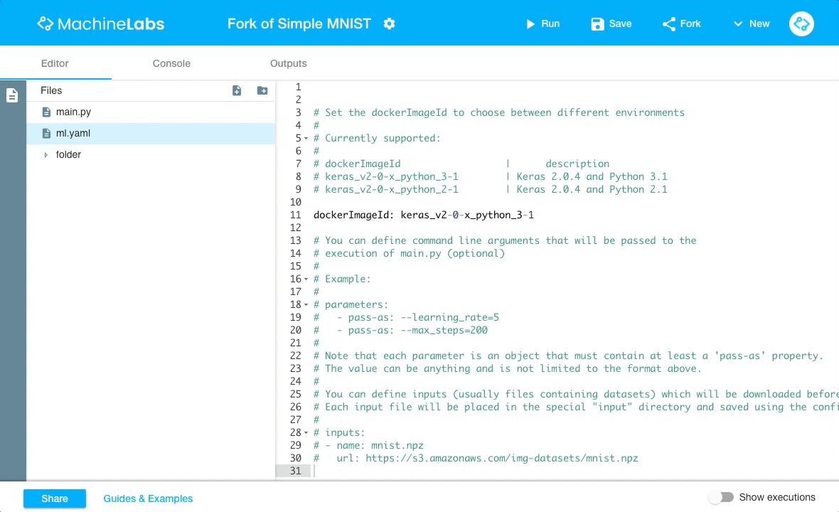
You may or may not have heard that we’re working on MachineLabs, a platform to run Machine Learning experiments in the browser. One essential UI component there is the file tree of the in-browser editor. In fact, we touched on that component in our article on custom theming. Users can create files and folders, edit them and delete them. Every time a user adds or edits a file or folder, a dialog pops open where users have a chance to decide on a name for the thing they edit or create.
This is a great scenario to learn about Angular Material’s dialog as we not only get to learn how to create and close them, but also how to use the same dialog for different actions, feeding it with different data depending on a certain context.
Let’s get right to it!
Creating dialogs with MatDialog
Angular Material comes with a very easy to use API to create dialogs using the MatDialog service. In order to get hold of it we first need to import the MatDialogModule into our application’s NgModule like this:
import { NgModule } from '@angular/core';
import { MatDialogModule } from '@angular/material';

@NgModule({
  ...
  imports: [
    ...
    MatDialogModule
  ]
})
export class AppModule {}
Remember that as of Angular Material 2.0.0-beta.10 MaterialModule is deprecated, which is why we’re importing MatDialogModule here right away. However, best practice is rather to create your own MaterialModule that imports and exports the needed material modules. We keep it simple here for the sake of this article.
Now that we’ve imported MatDialogModule we can start using its services and directives. Let’s take a look at where and when we want to create a dialog. As mentioned, the file tree allows users to add or edit files and folders. Too keep things simple, let’s start of with opening a dialog when the “add file” button is clicked.
Here’s what the template of the file tree could look like:
<ul>
  <li *ngFor="file of files">
    {{file.name}}
  <li>
</ul>
<button (click)="openAddFileDialog()">Add file</button>
The corresponding component looks something like this (again, simplified):
@Component(...)
export class FileTreeComponent {

  openAddFileDialog() {

  }
}
Great. Now all we have to do is to use Angular Material’s MatDialog service to create a dialog. To do that we need to inject an instance of that service into our component and tell it what component type to use to create such a dialog using its open() method. Let’s say we create a component FileNameDialogComponent which takes care of showing an input control so users can enter a name of a new file.
import { MatDialog, MatDialogRef } from '@angular/material';
import { FileNameDialogComponent } from '../file-name-dialog';

@Component(...)
export class FileTreeComponent {

  fileNameDialogRef: MatDialogRef<FileNameDialogComponent>;

  constructor(private dialog: MatDialog) {}

  openAddFileDialog() {
    this.fileNameDialogRef = this.dialog.open(FileNameDialogComponent);
  }
}
Another thing we need to do is to add FileNameDialogComponent to our application module’s entryComponents, since it’s dynamically created at runtime.
@NgModule({
  ...
  declarations: [
    ...
    FileNameDialogComponent
  ],
  imports: [
    ...
    MatDialogModule
  ],
  entryComponents: [FileNameDialogComponent]
})
export class AppModule {}
There are a couple of things to note here. We’re injecting MatDialog into our component and call its open() method with the FileNameDialogComponent type when a user wants to add a file. MatDialog#open() returns a MatDialogRef which is, as the name states, a reference to the now created dialog. Yeap, the dialog has already been created with just this little amount of code.
The dialog reference is important because it lets us react to when something with our dialog happens. Also, it turns out that we have access to the same reference inside the dialog itself, enabling us to control the dialog from there. We’ll see in a second when this is useful.
Let’s reward ourselves first and take a look at what we’ve already created:
Configuring dialogs
Every dialog created using MatDialog already comes with a decent default behaviour and default configuration. However, we can still tune things to our needs. This includes things like the width or height of the dialog. Or whether the dialog should have a backdrop or not. Dialog configuration can be easily passed as a second argument to MatDialog#open() as an object like this:
@Component(...)
export class FileTreeComponent {
  ...
  openAddFileDialog() {
    this.fileNameDialogRef = this.dialog.open(FileNameDialogComponent, {
      hasBackdrop: false
    });
  }
}
For a full list of configuration options checkout the dedicated API documentation.
Adding Material look & feel
Let’s take care of giving our dialog a more Material look & feel. This is obviously not a requirement as we’re free to style our dialogs the way we want, but for the sake of this article we stick with what Angular Material has to offer right out of the box.
To make our dialogs look more like they come straight our of Google’s offices, Angular Material comes with a couple of directives that we can use, which take care of adding a Material Design look & feel to our component. Those directives are:
- [mat-dialog-title] - Renders a nice looking dialog title in Material Design
- mat-dialog-content - Takes care of rendering a consistent dialog content area for things like texts, forms etc.
- mat-dialog-actions - Good for action elements like buttons to confirm or close a dialog
Alright, that’s use those in our FileNameDialogComponent:
@Component({
  template: `
    <h1 mat-dialog-title>Add file</h1>
    <mat-dialog-content>
      Content goes here
    </mat-dialog-content>
    <mat-dialog-actions>
      <button mat-button>Add</button>
      <button mat-button>Cancel</button>
    </mat-dialog-actions>
  `
})
export class FileNameDialogComponent {}
Okay, this already looks much better. Next we take care of accessing data returned by a dialog.
Returning data from dialogs
Now that our dialog looks good as well, we need to find a way to let the user enter a file name and once confirmed, taking that name and create a new file object in our application. As mentioned earlier, each MatDialogRef gives us APIs to react to events emitted by a dialog. When a dialog gets closed, either by hitting the escape key or by closing it using APIs, the afterClosed() Observable emits. From within the dialog, we can control if and what gets emitted by the dialog when it’s closed, giving us all the tools we need complete implementing this feature.
Let’s first take care of emitting the file name entered by the user after closing the dialog. To do that we create a small form within our FileNameDialogComponent which will close the dialog once it’s submitted.
import { Component, OnInit } from '@angular/core';
import { MatDialogRef } from '@angular/material';
import { FormGroup, FormBuilder } from '@angular/forms';

@Component({
  templateUrl: './file-name-dialog.component'
})
export class FileNameDialogComponent {

  form: FormGroup;

  constructor(
    private formBuilder: FormBuilder,
    private dialogRef: MatDialogRef<FileNameDialogComponent>
  ) {}

  ngOnInit() {
    this.form = this.formBuilder.group({
      filename: ''
    })
  }

  submit(form) {
    this.dialogRef.close(`${form.value.filename}`);
  }
}
Notice how we inject MatDialogRef<FileNameDialogComponent>. Yes, this is exactly the same reference we have access to from within our FileTreeComponent. MatDialogRef has a method close() which will essentially close the dialog. Any data that is passed to that method call will be emitted in its afterClosed() stream. Since the template got a little bigger now, we’ve extracted it into its own template file.
Here’s what it looks like:
<form [formGroup]="form" (ngSubmit)="submit(form)">
  <h1 mat-dialog-title>Add file</h1>
  <mat-dialog-content>
    <mat-form-field>
      <input matInput formControlName="filename" placeholder="Enter filename">
    </mat-form-field>
  </mat-dialog-content>
  <mat-dialog-actions>
    <button mat-button type="submit">Add</button>
    <button mat-button type="button" mat-dialog-close>Cancel</button>
  </mat-dialog-actions>
</form>
One thing to point out here is that we use the mat-dialog-close directive, which is kind of the equivalent to (click)="dialogRef.close()", just that we don’t have to type it out every time. If all these forms APIs are new to you, we recommend checkout out our articles on Template-driven Forms and Reactive Forms in Angular.
Great! Now that our dialog emits the entered file name, we can access it from within FileTreeComponent and create a new file object. In order to do that, we subscribe to fileNameDialogRef.afterClosed(). We also need to make sure that we only perform our file object creation when the emittion has an actual value and isn’t an empty string. This can be done easily by using Reactive Extensions and its filter operator (obviously we should add some validation for that but let’s not get distracted too much here).
...
import { filter } from 'rxjs/operators';

@Component(...)
export class FileTreeComponent {
  ...
  openAddFileDialog() {
    this.fileNameDialogRef = this.dialog.open(FileNameDialogComponent, {
      hasBackdrop: false
    });

    this.fileNameDialogRef
        .afterClosed()
        .pipe(filter(name => name))
        .subscribe(name => this.files.push({ name, content: '' }));
  }
}
That’s it! We can now add new files to our file tree via our brand new dialog. As mentioned earlier, we would also obviously take care of some validation, such as not allowing the user to submit the form when no file name has been entered. Another thing we might want to ensure is that no duplicated files can be created. However, this is out of the scope of this article.
Here’s our app in action:
Sharing data with dialogs
There’s one more thing we need to implement to make our dialog also work for scenarios where users want to edit an existing file name - sharing data between dialogs. When users edit a file name, we most likely want to simply reuse the same dialog we’ve just created because it’s essentially exactly the same form with the same rules and same behaviour, just that it should be pre-filled with the name of the file to edit. In other words, we need to find a way to pass data to the dialog that’s going to be opened.
Luckily, this is quite easy because Angular Material got us covered! It turns out that we can pass any data we want to a dialog using its configuration when the dialog is created. All we have to do is to attach the data we need inside the dialog to the configuration’s data property.
Since we want to use the same dialog for both actions, let’s also rename openAddFileDialog() to openFileDialog() and give it an optional file parameter. Here’s what that would look like:
<ul>
  <li *ngFor="file of files">
    {{file.name}}
    <button (click)="openFileDialog(file)">Edit file</button>
  <li>
</ul>
<button (click)="openFileDialog()">Add file</button>
Now, we also need to check inside our component whether a file has been passed to that method or not, and pass it on to the dialog like this:
@Component(...)
export class FileTreeComponent {
  ...
  openFileDialog(file?) {
    this.fileNameDialogRef = this.dialog.open(FileNameDialogComponent, {
      hasBackdrop: false,
      data: {
        filename: file ? file.name : ''
      }
    });
    ...
  }
}
All we need to do now is taking this data in our dialog and pre-fill our the form control accordingly. We can inject any data that is passed like that using the MAT_DIALOG_DATA injection token.
import { Component, OnInit, Inject } from '@angular/core';
import { MatDialogRef, MAT_DIALOG_DATA } from '@angular/material';

@Component({
  templateUrl: './file-name-dialog.component'
})
export class FileNameDialogComponent implements OnInit {

  form: FormGroup;

  constructor(
    private formBuilder: FormBuilder,
    private dialogRef: MatDialogRef<FileNameDialogComponent>,
    @Inject(MAT_DIALOG_DATA) private data
  ) {}

  ngOnInit() {
    this.form = this.formBuilder.group({
      filename: this.data ? this.data.name : ''
    })
  }
}
Last but not least we need to ensure that when the dialog is closed, we update the file that has been edited instead of adding a new one. We keep it simple and just look for the index of the file that’s being edited and replace it with the updated one.
...

@Component(...)
export class FileTreeComponent {
  ...
  openAddFileDialog(file?) {
    ...

    this.fileNameDialogRef.afterClosed().pipe(
      filter(name => name)
    ).subscribe(name => {
      if (file) {
        const index = this.files.findIndex(f => f.name == file.name);
        if (index !== -1) {
          this.files[index] = { name, content: file.content }
        }
      } else {
        this.files.push({ name, content: ''});
      }
    });
  }
}
Again, this is a trivial file tree implementation. In a real-world app we probably want to take care of having nested directories as well, which changes the level of complexity dramatically here. However, since this article is really all about how easy it is to create dialogs using Angular Material, we stick with what we have.
Where to go from here
This was it! Even though something like creating dialogs is usually rather tricky, with a UI library like Angular Material, this task really becomes a breeze. In fact, over at MachineLabs we have created several dialogs in different places of the application because it’s such an easy thing to do with given tools at hand.
Where do we go from here? Using the built-in dialog APIs, we get pretty far and only more sophisticated scenarios require a bit more brain work. For example, one thing we also did at MachineLabs was creating our own custom overlay so we could create Google Drive-like file preview.
In our next article we’ll explore how to create custom overlays and overlay services using the Angular Component Development Kit!
